Virulence Gene Insights.
Visualized.
Campylobacter is the leading cause of bacterial gastroenteritis worldwide, and the most common strains, Campylobacter jejuni and Campylobacter coli are commonly studied and their virulence-associated genes profiled. These genes play roles in bacterial survival, host interactions, and environmental persistence.[1]
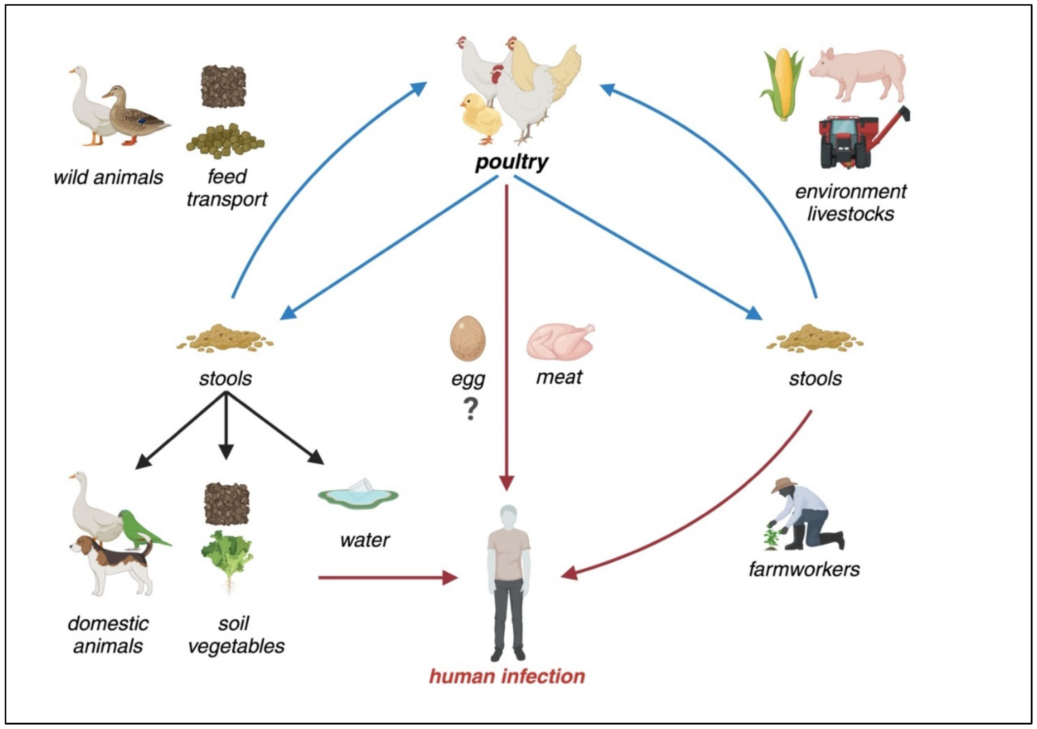
Transmission, environmental reservoirs, and risk factors for human Campylobacteriosis. As a zoonotic disease, poultry is the primary reservoir for Campylobacter. In non-endemic regions, consuming raw or undercooked poultry meat and direct contact with animals are the primary risk factors. However, in endemic areas, environmental contamination, including water sources, along with poultry contact, increased meat consumption, and inadequate hygienic practices contribute to the widespread persistence of the bacterium.[1]
Understanding the variations in gene expression across species and hosts is important for identifying broader patterns rather than individual biological outcomes. This dashboard focuses on visualizing those patterns in a clear and interactive way.
Explore patterns in Campylobacter jejuni and Campylobacter coli through clear, data-driven storytelling.
What You Can Do
Our platform helps you analyze and visualize virulence data intuitively.
Visual Storylines
Explore key questions about virulence genes through interactive data narratives.
Gene Virulence by Host Association
Compare human vs multi-host prevalence and hover to see gene roles and prevalence gaps.
This chart shows the prevalence of key virulence genes across different host environments, revealing which genes are conserved across hosts versus those that are host-specific. Bars represent prevalence percentages, allowing you to quickly identify patterns of gene distribution.
Summary Source: Gene Summary Document
Content derived from NCBI resources.
Gene Expression of Virulence Genes Across Species and Strains
This table shows whether selected virulence-associated genes are expressed in Campylobacter jejuni compared with Campylobacter coli, based on the project dataset. The comparison highlights species-level differences in virulence gene repertoires.
Gene expression is derived from genomic annotation. Hover over gene names to view locus tag and chromosome location information.
Summary Source: Gene Summary Document
Content derived from NCBI resources.
Virulence Genes Grouped by Biological Function
This section organizes virulence-associated genes by their annotated functional roles in the project dataset. Expand each category to view the genes included.
Tip: Click on a gene to view its full profile and detailed annotation.
Note: Refer to the Gene Expression table above for presence patterns across species.
Summary Source: Gene Summary Document
Content derived from NCBI resources.
Gene Co-Occurrence Network
This network visualization shows which virulence genes tend to appear together in the same bacterial isolates. Each circle (node) represents a gene. Larger circles mean the gene appears more frequently. Lines (links) connect genes that co-occur. Thicker lines mean those genes are found together more often. Genes are color-coded by function: red (toxin), blue (adhesion), green (invasion), orange (motility). Hover over nodes to see details, or click to explore specific genes.
Summary Source: Gene Summary Document
Content derived from NCBI resources.
Comparison of Virulence Gene Presence Between Species
This chart compares the presence of selected virulence-associated genes between Campylobacter jejuni and Campylobacter coli. Bars indicate whether a gene is present for each species among the selected top genes.
A value of 1 indicates gene presence; 0 indicates absence. When percentages are enabled, values represent prevalence.
This view highlights genes that are shared across species versus those that appear species-specific in the dataset.
Summary Source: Gene Summary Document
Content derived from NCBI resources.
Gene Function Distribution
Distribution of genes by functional category (Adhesion, Invasion, Toxin, Motility, Iron uptake, Stress response, Other). Hover to see counts and percentages.
Summary Source: Gene Summary Document
Content derived from NCBI resources.
Hierarchical View: Species → Host → Gene Count
This visualization shows how gene counts are distributed across all isolates, first by species and then by host category. Segment size reflects the relative gene count, and color indicates species.
Summary Source: Gene Summary Document
Content derived from NCBI resources.
Distribution of Virulence Genes Across Host Categories
This visualization shows how virulence-associated genes are distributed across different host categories. Connections link host groups to genes, with thicker connections indicating a higher number of isolates containing that gene within the host.
This view highlights which genes are most commonly associated with specific host categories in the dataset.
Summary Source: Gene Summary Document
Content derived from NCBI resources.
About This Project
Turning complex virulence gene data into simple insights.
Virulence Insights is a student-led data storytelling project that visualizes patterns in Campylobacter jejuni and Campylobacter coli virulence factors through interactive visualizations.
Funding: Supported by the Grant (Grant ID: GRANT-XXXX).
Our Team
Developed by a group of research enthusiasts exploring data-driven biology.

Gerald Shimo
Full-Stack Developer

Hawulethu Ndlovu
Product Manager and Data Analyst

Praise Fabiyi
BioInformatics Engineer

Dr. Raj
Faculty Advisor